一个实例 with rf
rf原理很简单,不多赘述,懒得实现直接调包吧
1.读入数据
数据来自https://www.kaggle.com/ludobenistant/hr-analytics
-
satisfaction_level : 满意度
-
last_evaluation : 绩效评估
-
number_project : 完成项目数
-
average_montly_hours : 平均月度工作时间
-
time_spend_company : 服务年限
-
Work_accident : 是否有工伤
-
left : 是否离职(选这个作为因变量,简陋的员工流失分析哈哈)
-
promotion_last_5years: 过去5年是否有升职
-
sales : 工作部门
-
salary:薪资水平
import pandas as pd
import numpy as np
import os
%matplotlib inline

## 将代码块运行结果全部输出,而不是只输出最后的,适用于全文
from IPython.core.interactiveshell import InteractiveShell
InteractiveShell.ast_node_interactivity = "all"

## 读入
os.chdir("/Users/mac/Desktop/快乐研一/python/机器学习/集成学习-例子")
df0 = pd.read_csv("HR_comma_sep.csv")
df = df0.rename(columns={'sales' : 'department'}) # 部门


## 检查缺失
df.isnull().any()
df.head()
df.shape
(14999, 10)
2.描述统计
2.1连续变量
df.describe()
| satisfaction_level | last_evaluation | number_project | average_montly_hours | time_spend_company | Work_accident | left | promotion_last_5years | |
|---|---|---|---|---|---|---|---|---|
| count | 14999.000000 | 14999.000000 | 14999.000000 | 14999.000000 | 14999.000000 | 14999.000000 | 14999.000000 | 14999.000000 |
| mean | 0.612834 | 0.716102 | 3.803054 | 201.050337 | 3.498233 | 0.144610 | 0.238083 | 0.021268 |
| std | 0.248631 | 0.171169 | 1.232592 | 49.943099 | 1.460136 | 0.351719 | 0.425924 | 0.144281 |
| min | 0.090000 | 0.360000 | 2.000000 | 96.000000 | 2.000000 | 0.000000 | 0.000000 | 0.000000 |
| 25% | 0.440000 | 0.560000 | 3.000000 | 156.000000 | 3.000000 | 0.000000 | 0.000000 | 0.000000 |
| 50% | 0.640000 | 0.720000 | 4.000000 | 200.000000 | 3.000000 | 0.000000 | 0.000000 | 0.000000 |
| 75% | 0.820000 | 0.870000 | 5.000000 | 245.000000 | 4.000000 | 0.000000 | 0.000000 | 0.000000 |
| max | 1.000000 | 1.000000 | 7.000000 | 310.000000 | 10.000000 | 1.000000 | 1.000000 | 1.000000 |
2.2 相关矩阵
corr = df.corr()
import seaborn as sns

sns.heatmap(corr,
            xticklabels=corr.columns.values,
            yticklabels=corr.columns.values)
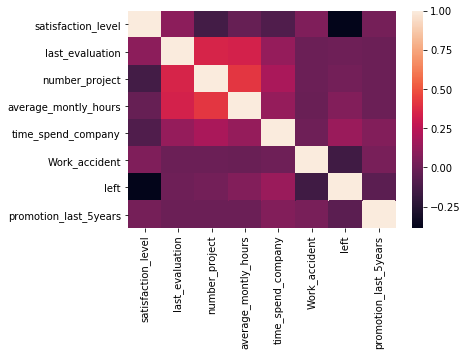
社畜真实,绩效和花费时间、项目数成正相关
2.3 分类变量
print(df.department.value_counts() / len(df), "\n")   # 哪些部门
print(df.salary.value_counts() / len(df))   # 工资水平分布
sales          0.276018
technical      0.181345
support        0.148610
IT             0.081805
product_mng    0.060137
marketing      0.057204
RandD          0.052470
accounting     0.051137
hr             0.049270
management     0.042003
Name: department, dtype: float64

low       0.487766
medium    0.429762
high      0.082472
Name: salary, dtype: float64
2.4 是否离职
离职率
# 离职率
print("离职率: {}".format(df.left.mean()))

# 按是否left group by自变量
df.groupby('left').mean()
离职率: 0.2380825388359224
| satisfaction_level | last_evaluation | number_project | average_montly_hours | time_spend_company | Work_accident | promotion_last_5years | |
|---|---|---|---|---|---|---|---|
| left | |||||||
| 0 | 0.666810 | 0.715473 | 3.786664 | 199.060203 | 3.380032 | 0.175009 | 0.026251 |
| 1 | 0.440098 | 0.718113 | 3.855503 | 207.419210 | 3.876505 | 0.047326 | 0.005321 |
大致看出,离职的人不咋满意、工作更长、没得到晋升
下面看看是否left(两个总体)在一些自变量上的分布是否存在差异
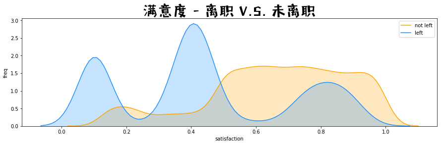
满意度 - 离职 V.S. 未离职
import matplotlib.pyplot as plt
import matplotlib.font_manager as mfm
font_path = r"/Users/mac/Library/Fonts/字体管家方萌简(非商业使用)v1.1.ttf"
prop = mfm.FontProperties(fname = font_path)

fig = plt.figure(figsize=(15,4),)
ax1 = sns.kdeplot(df.loc[(df['left'] == 0), 'satisfaction_level'] , color='orange', shade=True, label='not left')
ax1 = sns.kdeplot(df.loc[(df['left'] == 1), 'satisfaction_level'] , color='dodgerblue', shade=True, label='left')
ax1.set(xlabel = 'satisfaction', ylabel = 'freq')
plt.title('满意度 - 离职 V.S. 未离职', fontproperties = prop, fontsize = 30)
绩效评估 - 离职 V.S. 未离职
fig = plt.figure(figsize=(15,4),)
ax1 = sns.kdeplot(df.loc[(df['left'] == 0), 'last_evaluation'] , color = 'orange', shade = True, label = 'not left')
ax1 = sns.kdeplot(df.loc[(df['left'] == 1), 'last_evaluation'] , color = 'dodgerblue', shade = True, label = 'left')
ax1.set(xlabel = 'satisfaction', ylabel = 'freq')
plt.title('绩效评估 - 离职 V.S. 未离职', fontproperties = prop, fontsize = 30)
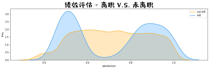
懂了,废物和大佬跑路之后,留在公司的都是混子
3. 建模
# 1.预处理的:
from sklearn.model_selection import train_test_split

# 2.建立决策树和rf
from sklearn import tree  # decision tree
from sklearn.ensemble import RandomForestClassifier  # rf
from sklearn.metrics import accuracy_score # 计算预测准确率
3.1 预处理
- 提取xy
- 把分类变量 string 调整为 category,再编码
- 切分训练和测试
# 1.提取特征
feature_names = [col for col in df.columns if col != 'left']
X = df.drop('left', axis = 1)
y = df['left']


# 2.处理字符串变量
print(dict(enumerate(df["department"].astype('category').cat.categories)))
X["department"] = X["department"].astype('category').cat.codes
X["salary"] = X["salary"].astype('category').cat.codes


# 3.分为训练和测试数据集
# 注意参数 stratify = y 意味着在产生训练和测试数据中, 离职的员工的百分比等于原来总的数据中的离职的员工的百分比
X_train, X_test, y_train, y_test = train_test_split( X, y, test_size = 0.2, stratify = y)
X_train.shape, X_test.shape
X_train.head()
{0: 'IT', 1: 'RandD', 2: 'accounting', 3: 'hr', 4: 'management', 5: 'marketing', 6: 'product_mng', 7: 'sales', 8: 'support', 9: 'technical'}


((11999, 9), (3000, 9))
| satisfaction_level | last_evaluation | number_project | average_montly_hours | time_spend_company | Work_accident | promotion_last_5years | department | salary | |
|---|---|---|---|---|---|---|---|---|---|
| 13660 | 0.50 | 0.77 | 3 | 267 | 2 | 0 | 0 | 4 | 0 |
| 5606 | 0.66 | 0.92 | 4 | 239 | 3 | 0 | 0 | 3 | 2 |
| 12322 | 0.61 | 0.47 | 2 | 253 | 3 | 0 | 0 | 7 | 1 |
| 2 | 0.11 | 0.88 | 7 | 272 | 4 | 0 | 0 | 7 | 2 |
| 587 | 0.80 | 0.83 | 2 | 211 | 3 | 0 | 0 | 8 | 1 |
3.2 决策树
# decision tree
clf = tree.DecisionTreeClassifier(
    criterion = 'gini',   # entropy_熵 也就是id3
    max_depth = 5,   # 树的深度限制
    min_weight_fraction_leaf = 0.005  # 叶子节点最少包含样本量
)
clf = clf.fit(X_train, y_train)     # 训练
clf.score(X_train, y_train)       # 拟合
y_pred_clf = clf.predict(X_test)    # 预测
accuracy_score(y_pred_clf, y_test)
0.9674139511625969

0.9646666666666667
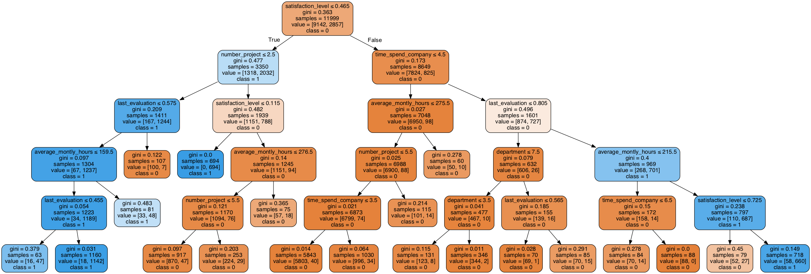
## 可视化:
from sklearn.externals.six import StringIO
from sklearn.tree import export_graphviz
import pydotplus
from IPython.display import Image

dot_data = StringIO()
export_graphviz(clf, out_file = dot_data,
                filled = True, rounded = True,
                special_characters = True,
                feature_names = feature_names,
                class_names = ['0','1'])
graph = pydotplus.graph_from_dot_data(dot_data.getvalue())    # 生成graph
Image(graph.create_png())     # 显示图片
3.3 rf
# decision tree
rf = RandomForestClassifier(
    criterion='gini',
    n_estimators = 10,     # 一共建立10颗树
    max_depth = None,
    min_samples_split = 5,
)

rf = rf.fit(X_train, y_train)     # 训练
rf.score(X_train, y_train)       # 拟合
y_pred_rf = rf.predict(X_test)    # 预测
accuracy_score(y_pred_rf, y_test)
0.9947495624635386

0.9866666666666667
3.4 对比决策树和随机森林
变量重要性方面
# importances 按照分割前后熵/gini_index的减少量算的
importances = pd.DataFrame({"feature": feature_names,  "rf_importances": rf.feature_importances_, "tree_importances": clf.feature_importances_})
importances

plt.figure(figsize = (12, 6))
plt.title("Feature importances by RandomForest")
plt.bar(range(len(importances)), importances['rf_importances'], color='lightblue',  align="center")
plt.step(range(len(importances)), np.cumsum(importances['rf_importances']), where='mid', label='Cumulative')
plt.xticks(range(len(importances)), feature_names, rotation='vertical', fontsize=14)
plt.xlim([-1, len(importances)])
plt.show()

plt.figure(figsize = (12, 6))
plt.title("Feature importances by RandomForest")
plt.bar(range(len(importances)), importances['tree_importances'], color='lightblue',  align="center")
plt.step(range(len(importances)), np.cumsum(importances['tree_importances']), where='mid', label='Cumulative')
plt.xticks(range(len(importances)), feature_names, rotation='vertical', fontsize=14)
plt.xlim([-1, len(importances)])
plt.show()
| feature | rf_importances | tree_importances | |
|---|---|---|---|
| 0 | satisfaction_level | 0.343161 | 0.563355 |
| 1 | last_evaluation | 0.145291 | 0.141229 |
| 2 | number_project | 0.173969 | 0.101539 |
| 3 | average_montly_hours | 0.136404 | 0.054792 |
| 4 | time_spend_company | 0.176457 | 0.138497 |
| 5 | Work_accident | 0.008887 | 0.000000 |
| 6 | promotion_last_5years | 0.000986 | 0.000000 |
| 7 | department | 0.009074 | 0.000589 |
| 8 | salary | 0.005771 | 0.000000 |
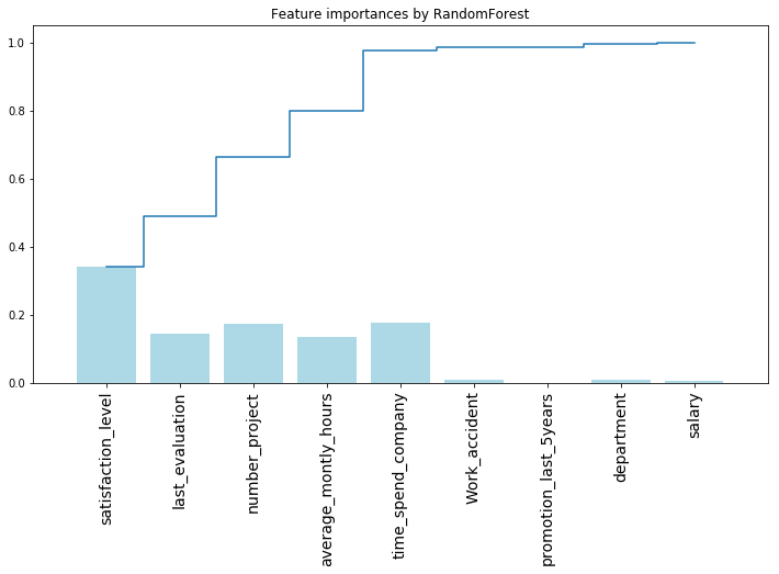
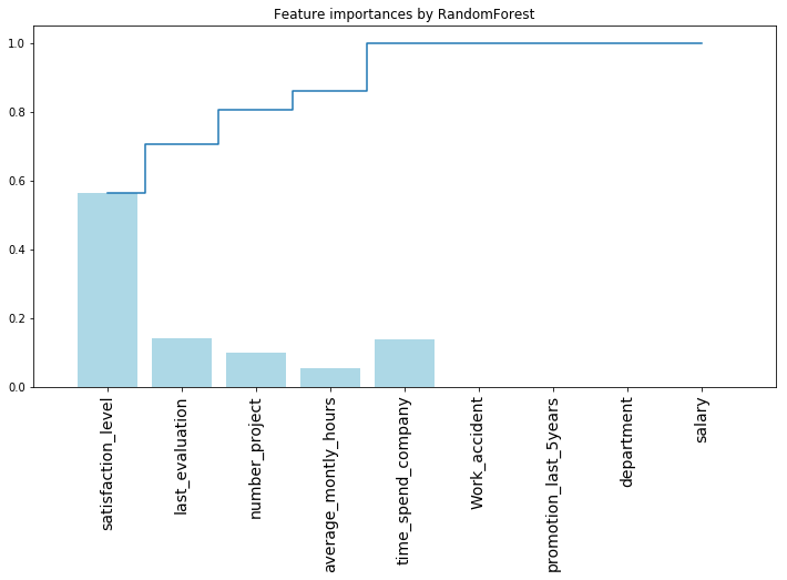
可以看出,随机森林特征重要性相对比较均匀
是由于每次分割遍历的特征集合是个 random choose 的特征子集,给了一些原本不太重要的属性more chance作为分割属性。
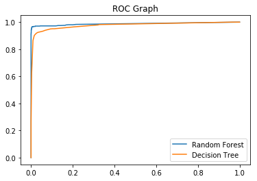
roc
from sklearn.metrics import roc_curve
rf_fpr, rf_tpr, rf_thresholds = roc_curve(y_test, rf.predict_proba(X_test)[:,1])
dt_fpr, dt_tpr, dt_thresholds = roc_curve(y_test, clf.predict_proba(X_test)[:,1])

plt.figure()
plt.plot(rf_fpr, rf_tpr, label='Random Forest')
plt.plot(dt_fpr, dt_tpr, label='Decision Tree')
plt.title('ROC Graph')
plt.legend(loc="lower right")
plt.show()